
“Cutch”
Helping families to manage their online experiences safely

INtroduction
In Jan 2018, I undertook a UX course General Assembly to gain further insight and experience of product design.
The 10 week course involved setting my own project which I based on the conflict which arises between parents and children and how to safely manage and control access to electronic and internet connected devices.
The case study below gives an outline of the process undertaken and final output.
A short version of the final presentation can be viewed here.
A full version of the study can be viewed here.
What is the Problem being solved?
I identified that many parents find managing their child’s access to devices was a problem area. This was supported by desk research that I had done and from personal experience . This led me to setting an initial problem statement to use as a starting point for my study.
“Managing access to electronic devices is a major conflict area between today’s
parent and child”


Methodology
The couse led us through a series of steps to identify the problem, validating this against users’ needs and evaluating the market to establish a problem statement.
Once personas were established, this enabled me to create prioritised user flows for a number of key problems and to draw up some low fi pencil prototypes for quick user testing.
Further investigation of user priorities was then completed which then led into wireframing. A high level prototype, with onboarding journeys was then created, tested with users and iterated upon.

User Testing
A small number of users were involved throughout the various stages to;
Validate the hypothesis
Test of low-fi pencil prototypes
Card sorting and prioritisation of features
Hi-fi prototype testing

Competitor Review
A competitor review was undertaken. These ranged from software providers which blocked access to the internet on devices to those providing a full hardware solution which connected directly to the wifi routers to block access.
Disney’s “Circle” could be seen to be a leading competitor in the market.

Key findings
After assessing users’ needs and looking at the gap analysis of competitors, the results were distilled in three key findings. These formed the basis of my product and were then used to derive initial product features.

The solution
I established that the product would need to have 4 components which would come together to create a tool that allows;
a parent to easily manage the devices in their family
monitor how their child uses each device
empower their children to learn how to manage their time themselves
The product would need to work in such a way that reduces the conflict between parents and their children.
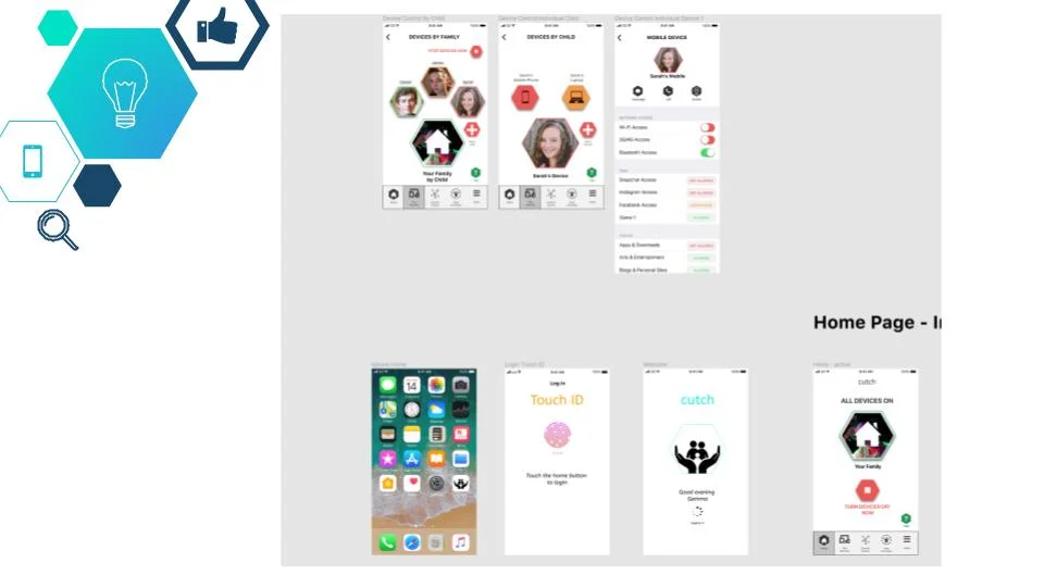
From the four components, this study then focused on creating a prototype for the Parent App.

Persona Development
The key findings from the user research were consolidated into personas.
This key persona highlighted a potential target audience of a mums with up to 3 children aged from 14 to 18.

Prioritising Features for an MVP release
This was a pivotal point in the project. Up until this point there had been a lot ideas generated. By determining a release strategy is was possible to priorities the most important features for release as a Minimum Viable Product (MVP)

Prioritising Navigation items
Whilst prioritisation was different for each user this exercise was useful to improve overall navigation around the app.

User Flows
There were a number of userflows developed for the study. Four are included here.
Collaboration with a technical team, as well as Legal and data protection would need to be undertaken to validate each flow.

Whiteboard prototyping
A quick was to sketch out ideas for the app was to use a whiteboard. My drawing skills need to be refined but essentially this process enabled me to create some initial product features, test with users and refine on the fly.
A low-fi clickable prototype was also created using Invision.

Clickable Prototype Design
Figma was used to design a clickable prototype. UX screens were devised first with links between pages then knitted together within the Figma tool. The app was designed for an Apple 8 handset but would need to be adapted for Android patterns.
Following a further round of user testing, amends were made and a simple UI layer then implemented. This meant that I was not sidetracked with aethetics but could focus on user flows and patterns.
The key learning from users was to keep the app simple and be sure to make screens clear for the user.
In terms of designing, I learnt to be very disciplined in tidying up Figma as the number of screens and connections soon became complicated.
The Figma prototype can be viewed here.

Development of a brand
In order to present the final app back to class I then worked on some initial positioning for a possible brand. This would enable me to “tell the story” of the app to any newcomer
This led to a mission statement, tone of voice and app name. Cutch is derived from a Welsh word, “cwtsh”, which means “cuddle” or “Safe Place”. A quick check with the App Store also showed that this name wasn’t in use yet!

Product Evolution
The product could sit by itself or could become part of the Nest of Hive ecosystems. Similarly, Cutch could become a feature built into suites of devices made my Apple or Sony.
Personal Reflection
The General Assembly course gave a fantastic insight into the stages that a UX researcher and designer steps through. Whilst there is so much more to learn, I found each stage stimulating
The study I chose was hugely ambitious and is in an area that many parents have concerns about